4 tips to make your content 'mobile friendly'
 Carel Schrier
Is the content on your website mobile friendly? Nowadays, many people use their phone to visit your website. In 2021, 55% of total website traffic came from a mobile device.
Given these figures, it is important to optimise the content on your website for mobile users.
If you do not do this, more than half of your website visitors may drop off because certain content is not properly suited to the mobile device they are using to read it at that moment.
But how can you best approach this?
In this blog, you will read a number of tips for optimising content on your website, such as blogs and landing pages, for mobile users. So that visitors ultimately have a better user experience when they visit your website on their mobile phone.
1. Think about the layout of your content
When creating a blog or another page on your website, it is first important to look at the formatting of the content you want to place on the page.
Keep your titles short
When you search on Google on your mobile phone, you see the titles of the webpages that come up in the search results.
To prevent part of your title from being cut off, it is recommended not to make your title longer than 60 characters. This way, you can always be sure that the full title is shown in a mobile Google search.
If people cannot read half of your title, the chance that they click on it becomes considerably smaller. Naturally, you do not want that. So always make the titles of your page short and strong.
Split your text into paragraphs
When writing the content of a page on your website, you also need to take a number of things into account to make your content mobile friendly.
It is anything but appealing for a page visitor to read long blocks of text one after another. So divide your pieces of text into short paragraphs and use blank lines.
As a rule, it is recommended not to make a paragraph longer than 6 lines.
Incidentally, this tip does not only apply specifically to content aimed at mobile users. Desktop users also find it more pleasant to read when you divide your content into short paragraphs.
2. Make use of images and videos
Once you have divided the text on your page into paragraphs, it is also advisable to incorporate visual elements into your page. This can, for example, be in the form of images or videos.
Mobile users in particular will find it pleasant when the text on a page is occasionally 'broken up' by an image or video.
It is important to use images that are relevant to the content they are placed with. If this is the case, it also gives a boost to your SEO.
So do not use images as filler material, only use them when they add value to the text you are writing.
Some visual examples you can use are:
- A relevant image that creates a picture for the text
- An infographic to visually support the text
- An instructional video of the product you offer
When uploading and adding visual files, it is always important to keep the size of these files as low as possible.
Heavy files of a few megabytes (MB) take a long time to load, and this comes at the expense of speed, and therefore the user experience of your page visitors.
There are various tools to compress the file size of an image. This can, for example, be done through Photoshop.
3. A tactical placement of your calls to action
Keep in mind that mobile users reading your content are often on the go. As a result, you often have only limited opportunity and time to capture their attention.
If you do not manage to capture the attention of a mobile website user within a short time, they will most likely quickly drop off. As a result, you immediately miss the opportunity for a conversion.
So do not only think about a logical next step a user should take after reading your content, but also focus on the placement of your call to action (CTA).
If you place the CTA somewhere near the beginning of your content, there is a greater chance that it will be seen and actually clicked on.
4. Preview your content before you publish it
Finally, we recommend always going over your content once more before you publish it. And in this case, we do not just mean the content, but especially the formatting and layout for mobile format.
If you create a webpage or blog in HubSpot, you have the option to preview it in mobile, tablet and desktop format before publishing your content.
Check your content from the reader's point of view and consider whether, given the formatting, it is actually appealing to read.
If you find, for example, that the pieces of text are quite long for mobile users, you can divide certain parts of your text into additional paragraphs.
Do you want to check whether pages that are already online are mobile friendly? We have a handy trick for that.
Go to the page in question and right-click somewhere on the page. Then select 'inspect'.
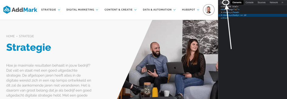
Then click the icon highlighted in the image above.
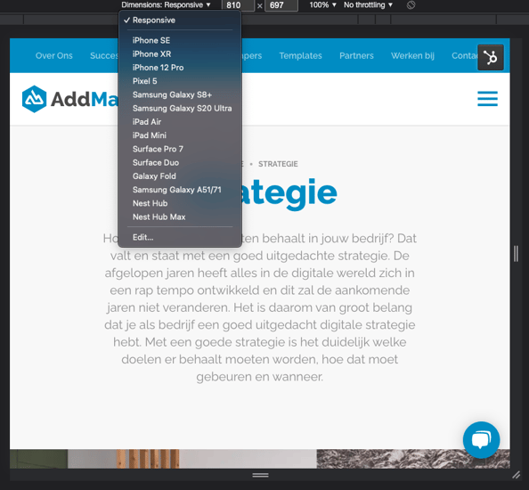
You will then see an adjusted screen view. You can adjust the screen view yourself by clicking 'Dimensions: Responsive'. This gives you a choice of different screen sizes from various mobile phones.
In short, in an era where mobile devices are used more than ever, it is important that your content aligns with this.
This contributes to a positive user experience for your mobile website visitors and increases the chance that they carry out a conversion action on your website.
So make sure that whenever you create content on your website, in whatever form, you pay attention to optimising this content for mobile formats.