How to build a good HubSpot homepage dashboard?
 Femke Jesterhoudt
Building a HubSpot homepage dashboard, step by step
Most people log into HubSpot and land on a dashboard someone else set up two years ago. Nine reports, four of which nobody has clicked since. Twenty minutes of work fixes that. Below: picking the reports that matter, arranging them so the important ones are visible without scrolling, and making the whole thing your default landing screen.

Step-by-step guide
1. Select important data
The first step is to determine which information you and your team need on a daily basis. Think of:
-
- Sales statistics: Such as revenue per month, open deals and the number of closed deals.
- Marketing reports: Data on leads, email campaign results and website traffic.
- Tasks and to-dos: Make sure you have visibility of outstanding tasks, both for you and your team.
- Campaign KPIs: Monitor the performance of ongoing marketing campaigns.
How do you select this data in HubSpot?
-
- Go to the "Reports" tab in your HubSpot account.
- Review your available standard reports and decide which ones matter to you.
- Also consider building custom reports to get specific insights that aren't available by default.
-
2. Customise the dashboard
Once you know which data matters, it's time to build your dashboard. But how do you make these changes in HubSpot?
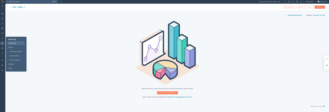
- Go to your HubSpot account and open the "Dashboard" tab.
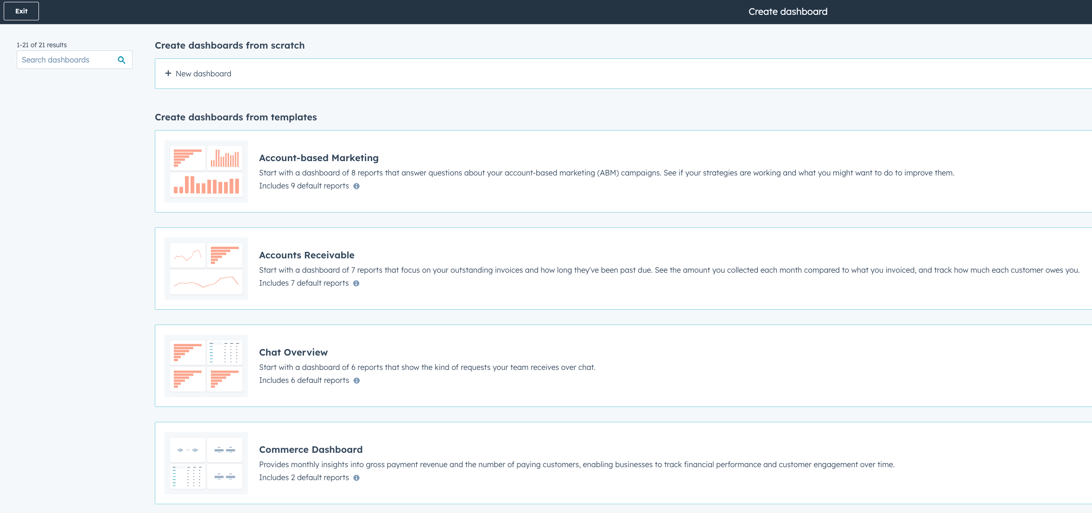
- Click "Create dashboard" or choose an existing dashboard you want to customise.
- Add widgets that show your most important reports, tasks and statistics. You can choose from several types of reports, including:
- Standard reports: HubSpot offers ready-made reports that you can easily add.
- Custom reports: Build your own reports by applying filters to specific datasets. This is useful if you want unique insights.
- External integrations: Use external tools that integrate with HubSpot, such as Google Analytics, to centralise data from different sources in one place.
3. Organise the dashboard
Once the widgets have been added, you need to organise the dashboard. Make sure the most important information is immediately visible when you open your dashboard. But what's the best way to organise the layout in HubSpot?
-
- Click and drag the widgets to the right position to rearrange them.
- Place the most crucial data, such as sales or lead statistics, at the top so it's always in view.
- Use colours or categories to highlight specific sections and improve readability.
4. Dashboard examples
Below are a few examples of dashboards you can put together, including the widgets you can add to optimise your workflow.
Marketing channel performance
If you spend money on more than one channel, this is the block to get right. Three widgets tell you where the leads come from and which source is quietly eating budget.
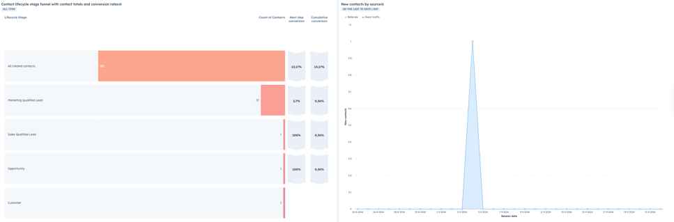
3.1. Contact lifecycle funnel
-
- Widget type
Funnel chart - Why?
This funnel gives an overview of how many contacts are in each stage of the lifecycle, from "All Created Contacts" to "Customer." This is useful for understanding conversion rates per stage and where optimisation may be needed. - Organisation tip:
Place this at the top of your dashboard so you always have insight into the status of your contact flow.
- Widget type
3.2. New contacts by source
-
- Widget type
Line chart - Why?
The line chart shows how many new contacts have been generated through different sources, such as referrals and direct traffic. This helps you analyse which marketing channels are most effective at attracting new leads. - Organisation tip:
Place this above or next to other lead-related widgets so you can quickly switch between the different sources.
- Widget type
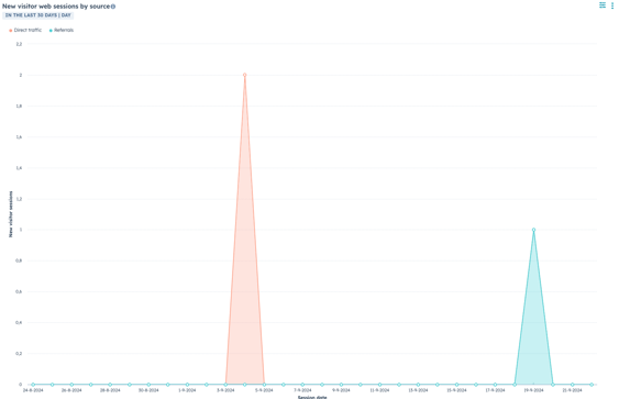
3.3. New website visitors by source
-
- Widget type:
Line chart - Why?
This widget shows how many new visitors visit your website, broken down by source such as direct traffic and referrals. This is essential for seeing which sources generate the most traffic to your website. - Organisation tip:
This can sit next to the widget for new contacts by source, giving you a complete overview of both visitors and generated leads.
- Widget type:
5. Sales channel performance
The sales block answers two questions: what is likely to close this quarter, and where do deals get stuck. Three widgets cover it.
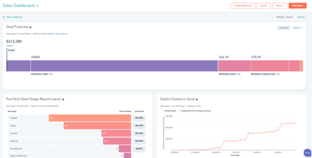
1. Deal forecast
-
- Widget type:
Forecast chart - Why?
This widget gives an overview of the expected deals for the coming period, based on current opportunities in your pipeline. This helps you anticipate future revenue and set realistic goals. - Organisation tip:
Place this widget at the top of your dashboard for a quick overview of expected revenue.
2. Deal stage
- Widget type:
Funnel chart - Why?
This funnel shows the number of deals in each stage of the sales cycle, from "New Lead" to "Closed Won." This gives insight into where deals stall and where you need to focus your attention. - Organisation tip:
Use different colours to quickly identify the status of deals.
3. Deal closed vs. goal
- Widget type:
Comparison chart - Why?
This widget shows closed deals versus the set goals for a given period. This helps evaluate the sales team's performance and identify any shortfalls. - Organisation tip:
Keep this widget prominent on your dashboard to quickly monitor progress towards your goals.
- Widget type:
6. Account based marketing
If you sell to a defined list of target accounts, it helps to see only those. Two widgets.
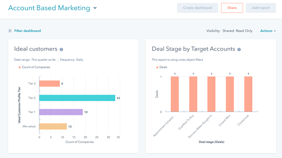
5.1. Ideal customers
-
- Widget type:
List view - Why?
This widget shows a list of your ideal customers, based on predefined criteria such as industry, size and other demographic data. This helps you focus on accounts with the highest potential for conversion. - Organisation tip:
Place this widget in the top section of your dashboard so you always have a clear overview of your most important target accounts.
5.2. Deal status
- Widget type:
Funnel chart - Why?
This funnel gives an overview of deal statuses specifically for your target accounts. It shows what stage of the sales cycle these accounts are in, from "Interested" to "Closed." This helps identify obstacles and optimise your approach. - Organisation tip:
Use a clear layout and colour coding to quickly assess the status of different accounts.
- Widget type:
7. Automate & share
Naturally, you want your dashboard to always be up to date without having to update reports manually. That's why HubSpot offers options for automating and sharing dashboards.
How do you automate and share dashboards in HubSpot?
-
- Automate: Set up automatic updates for your reports. This ensures the data is updated in real time without you having to take any action yourself.
- Share dashboard: Working in a team? Share the dashboard with colleagues so everyone has the same insights. You can do this by clicking "Share" on the dashboard and then giving the right users or teams access. You can even set permissions, such as read-only or edit, depending on what's needed.
8. Make it the default
Once you're happy with the dashboard, you'll want to make sure it's always immediately visible when you open HubSpot. You can do this by setting the dashboard as your default homepage.
How do you make your dashboard the default in HubSpot?
-
- Go to your dashboard settings and choose "Set as default". This will automatically load the dashboard when you log in, making it the first screen you see.
- Go to your dashboard settings and choose "Set as default". This will automatically load the dashboard when you log in, making it the first screen you see.
Why bother
The gain is smaller than most productivity posts claim, and different in kind. You do not save hours. You save the twenty small moments a week where someone asks a colleague for a number that was already on a screen. Once pipeline and lead sources sit on the page everyone opens in the morning, the Monday status meeting gets a lot shorter.
Three things worth knowing
Once the basics are up, these three make the difference between a dashboard people use and one they close again.
- Use filters: Filters work on the whole dashboard, not just one report. Filtering by team or region once beats building separate reports per team.
- Dashboards for specific goals: Split by audience rather than by topic. A management overview and a marketing dashboard need different levels of detail, even when they show the same pipeline. (see the examples above)
- Regular review: Every dashboard collects reports nobody reads. Once a quarter, delete anything you have not clicked.
Want to know more about the many possibilities of HubSpot? Book a free call with Carel or get in touch with Sander!